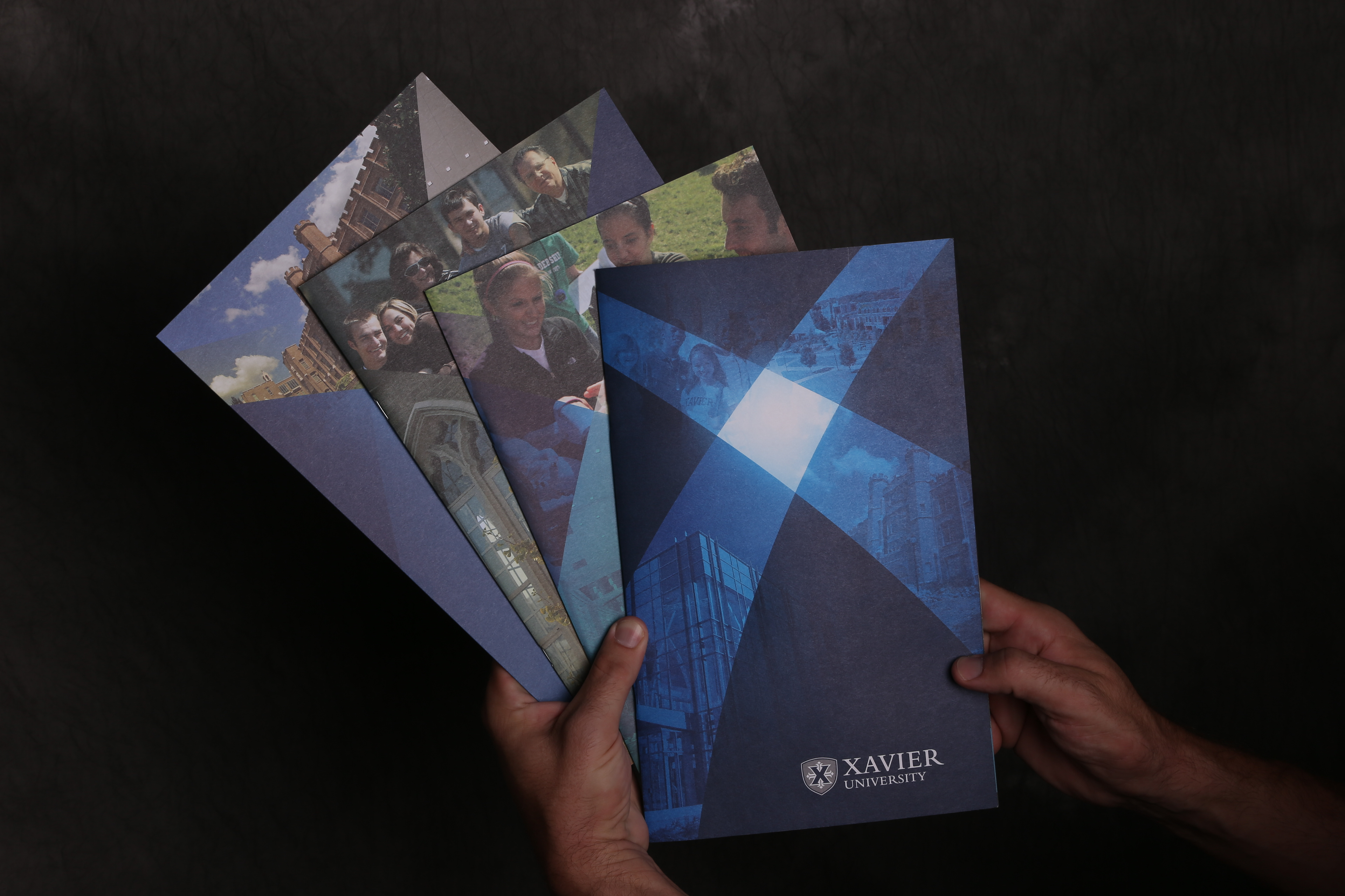
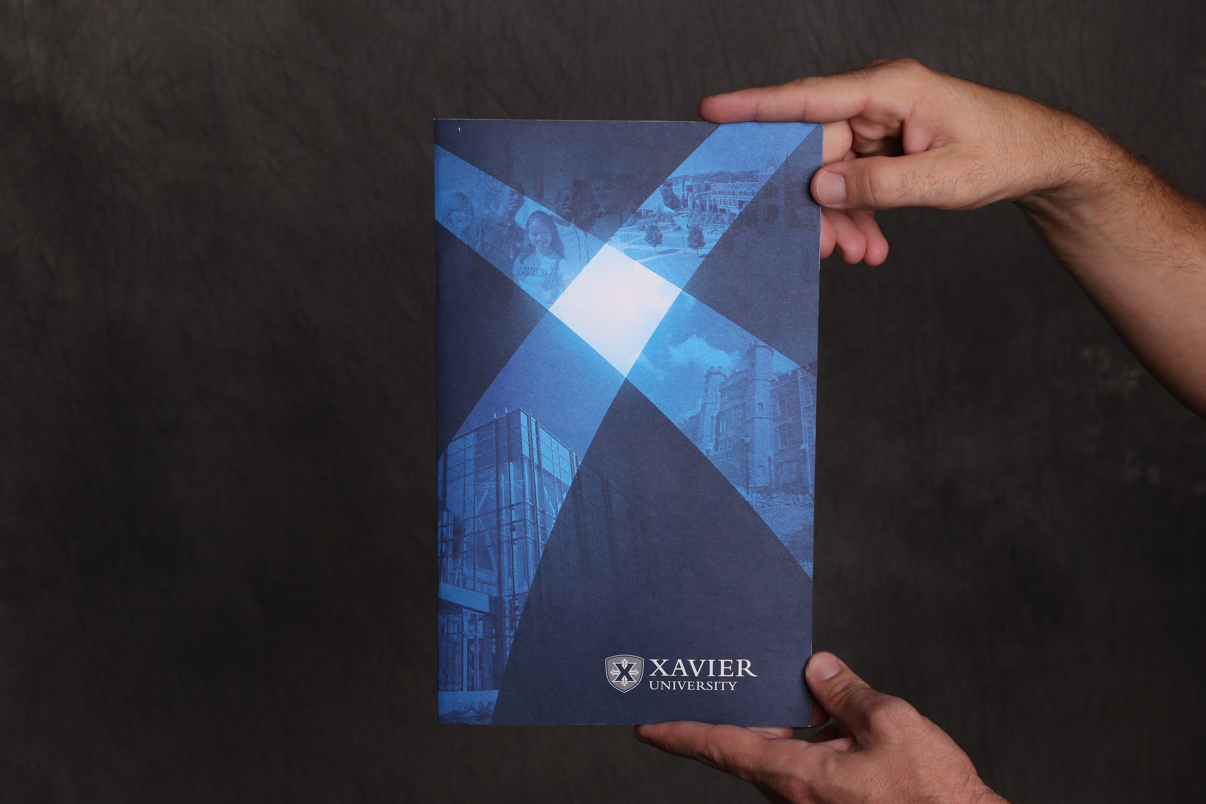
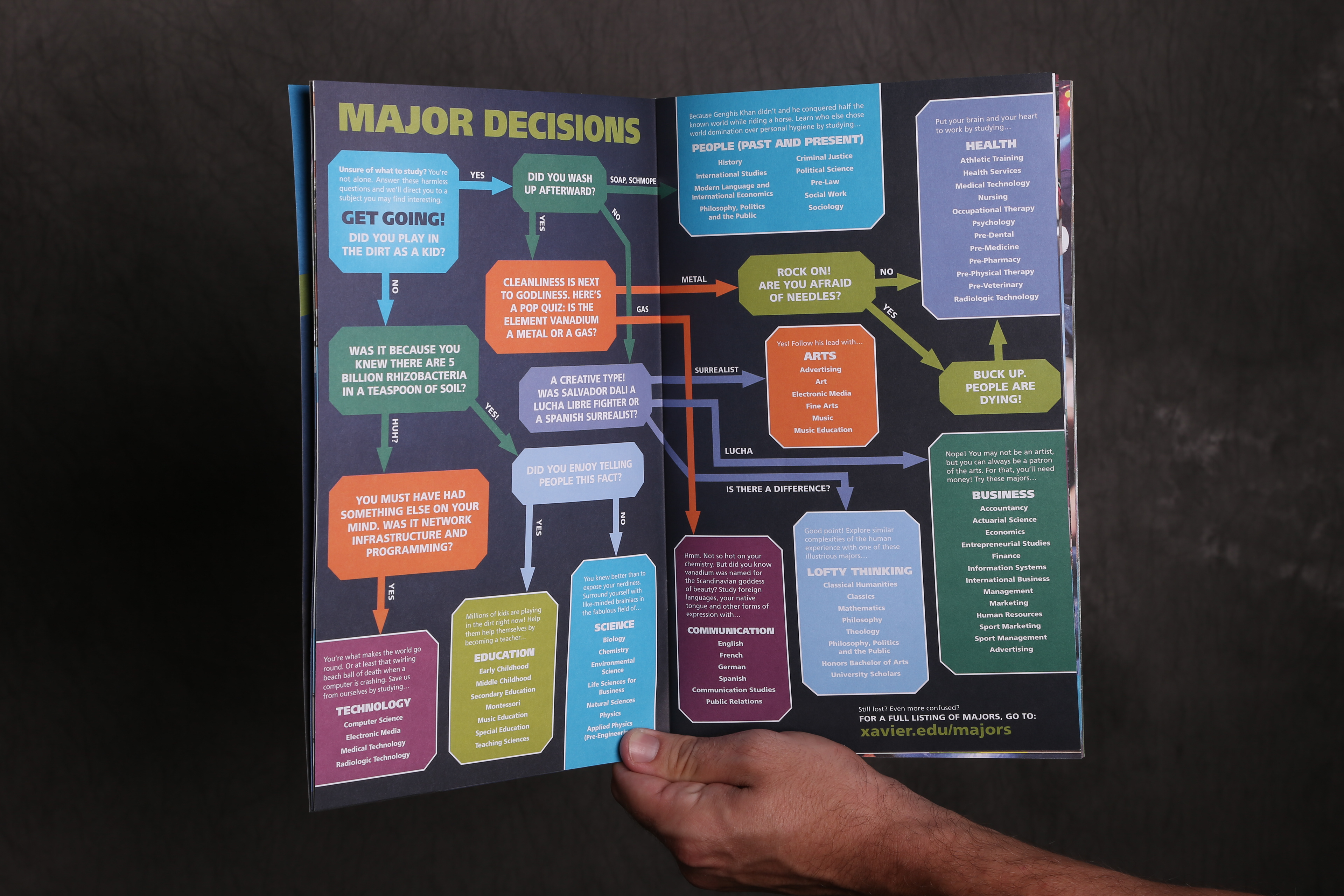
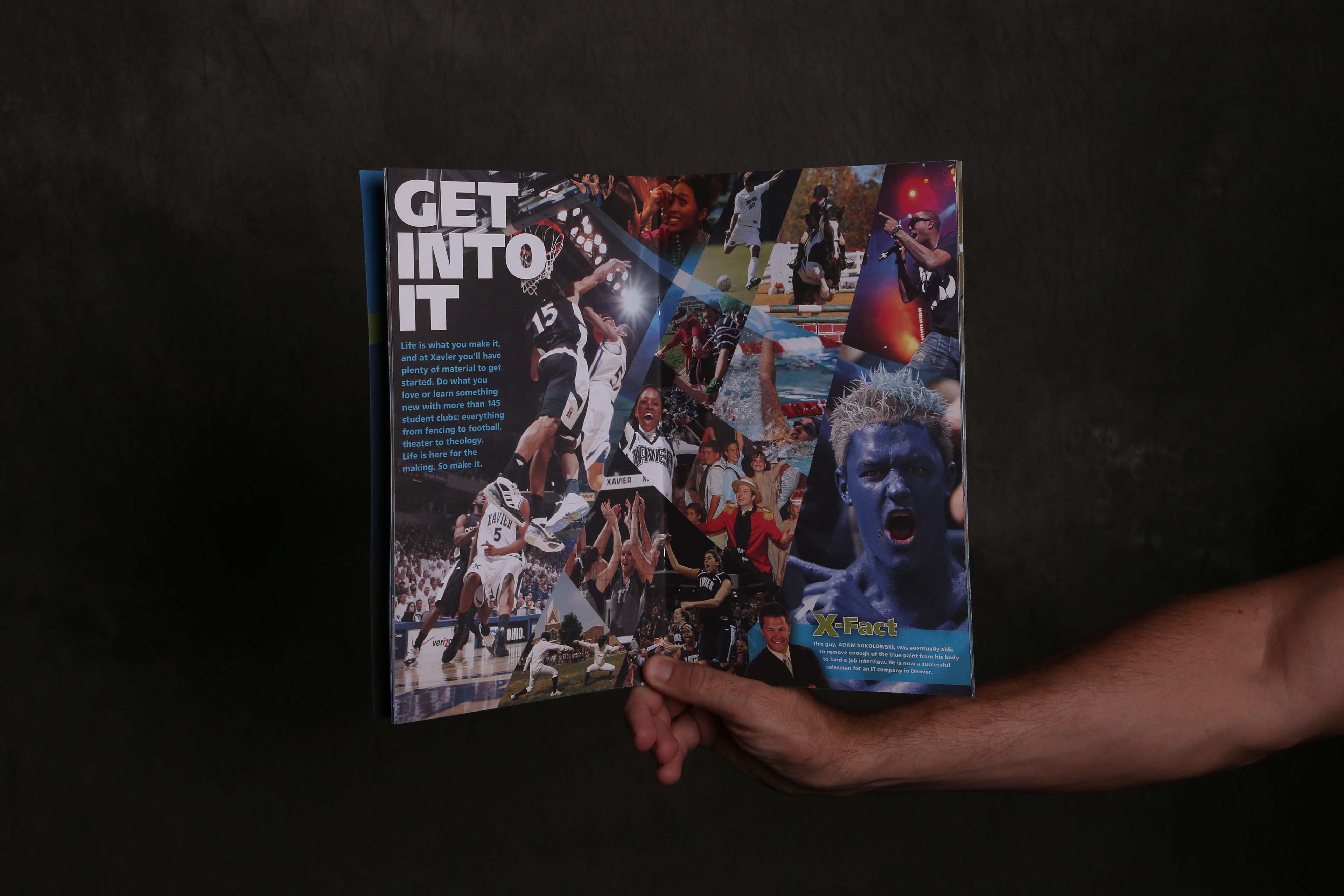
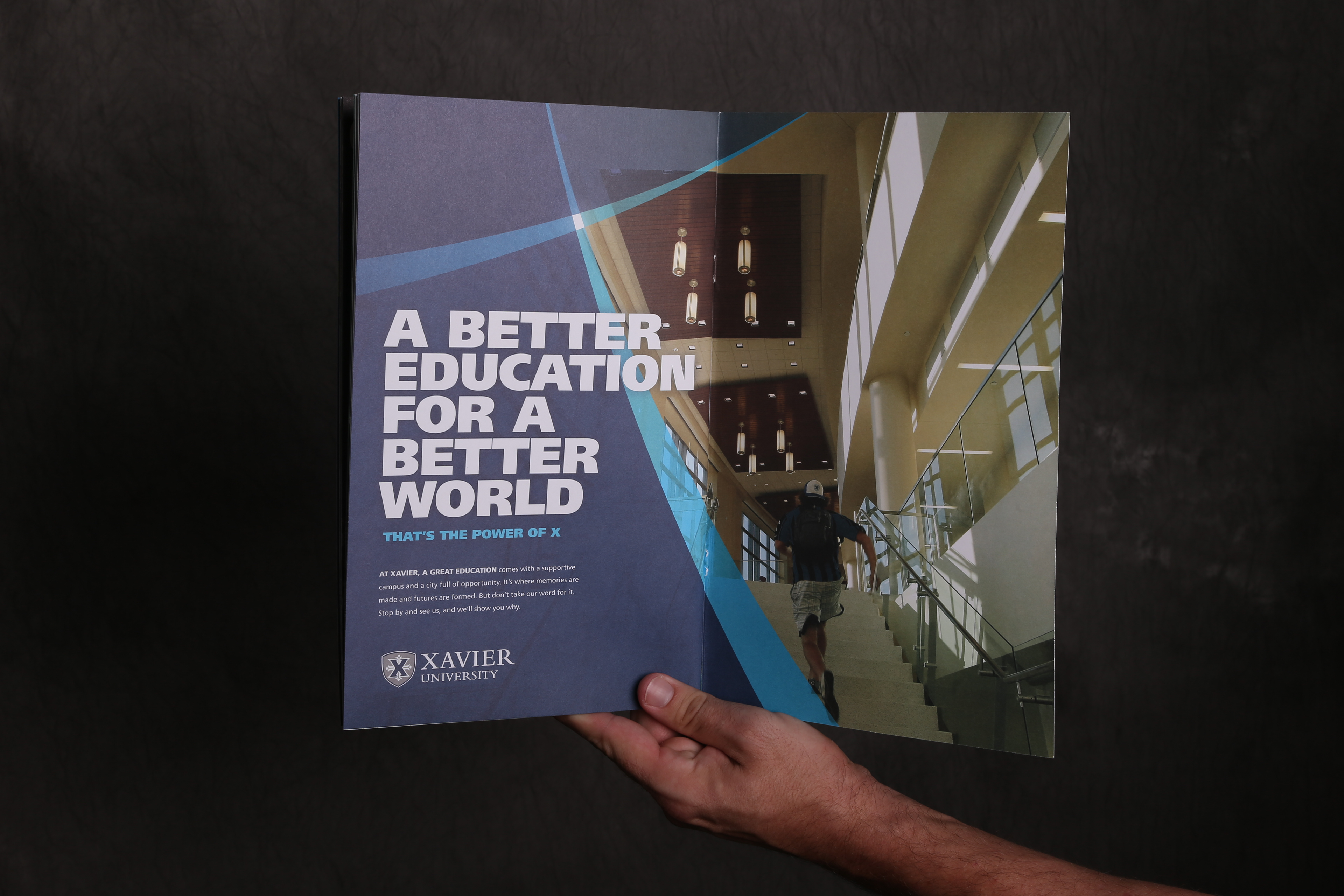
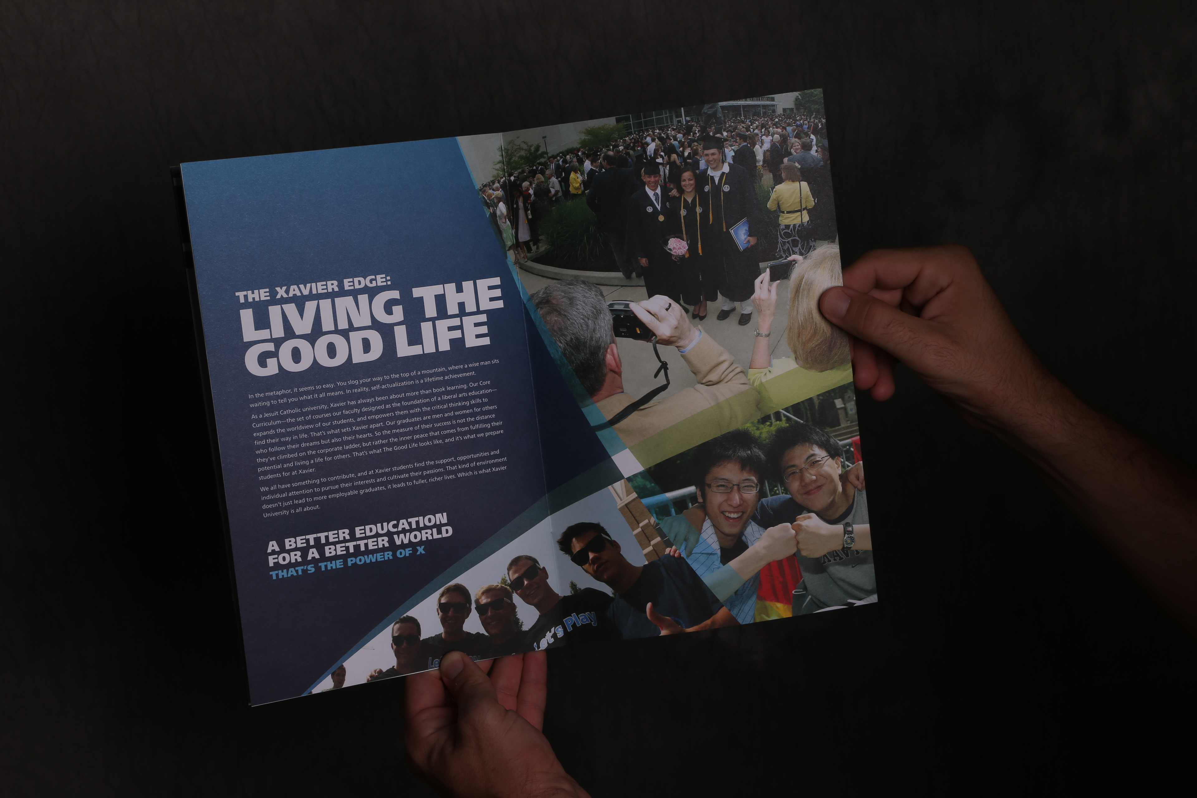
During my time at Xavier University, I was the Creative Lead for all Undergraduate Admissions materials. Over the years, dozens of annually produced pieces were put in place without any real strategy, consistency or audience consideration. I suggested that we rethink the entire admissions package and ran the brainstorming and strategy that drove us into the yearlong process of building out the new pieces.
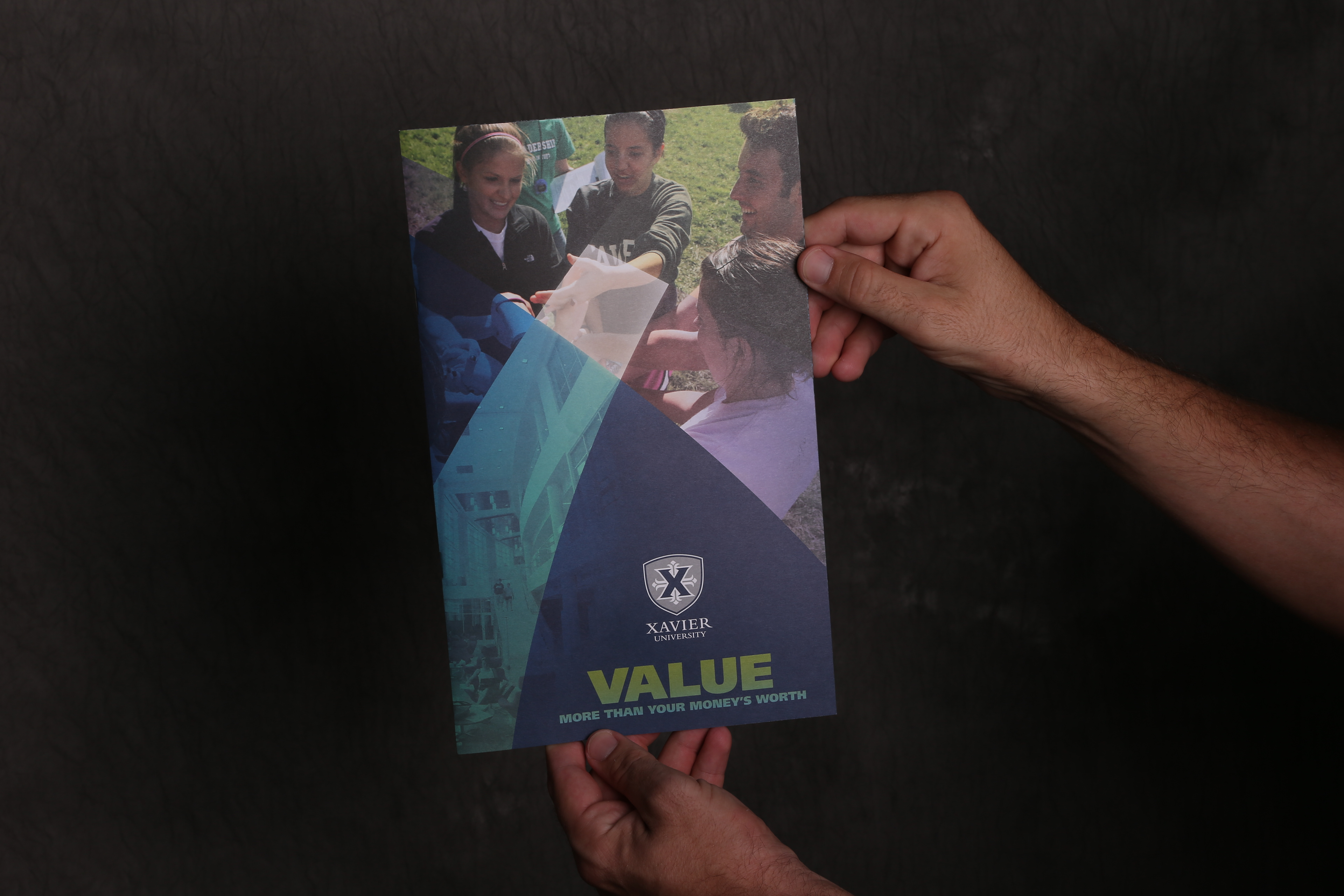
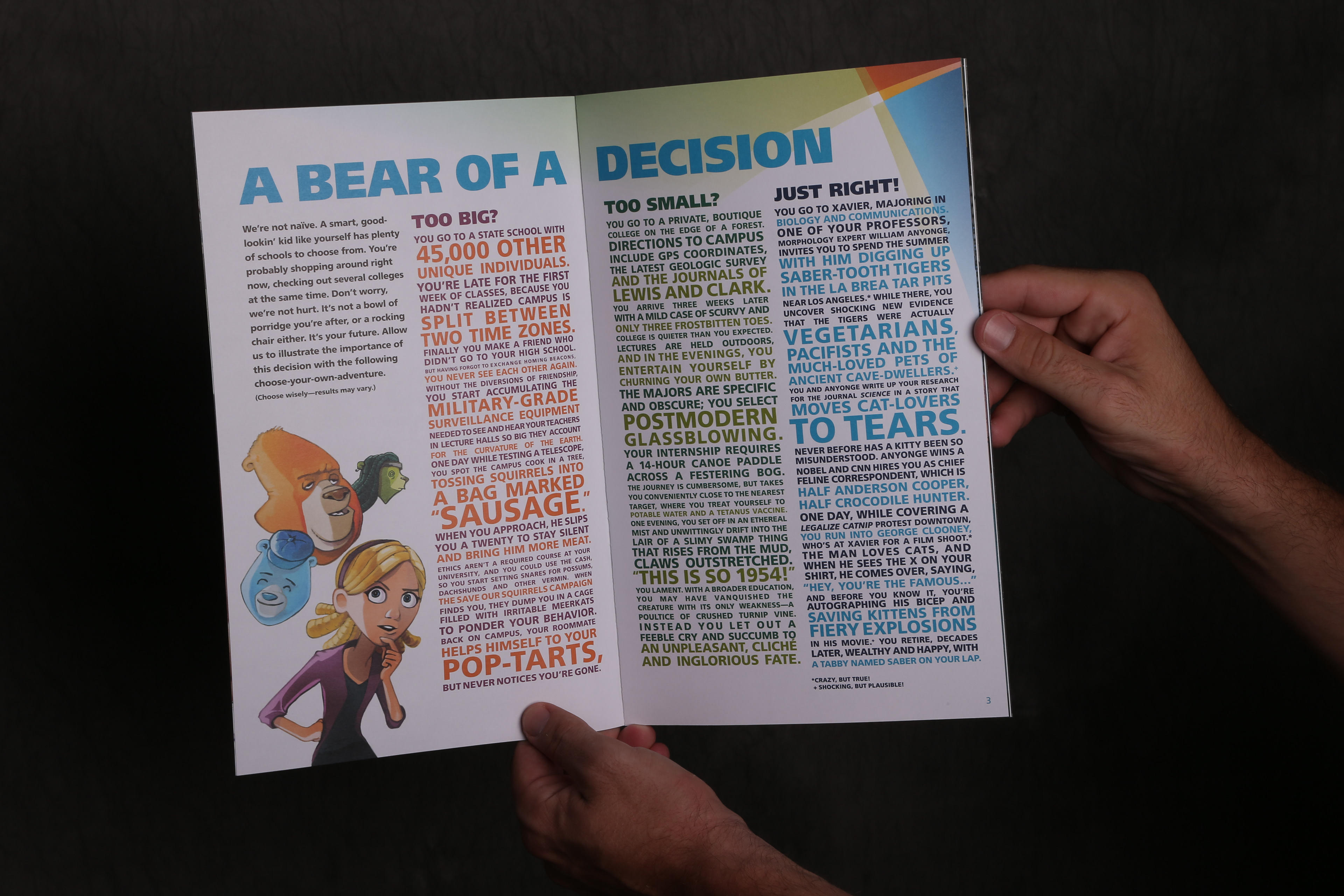
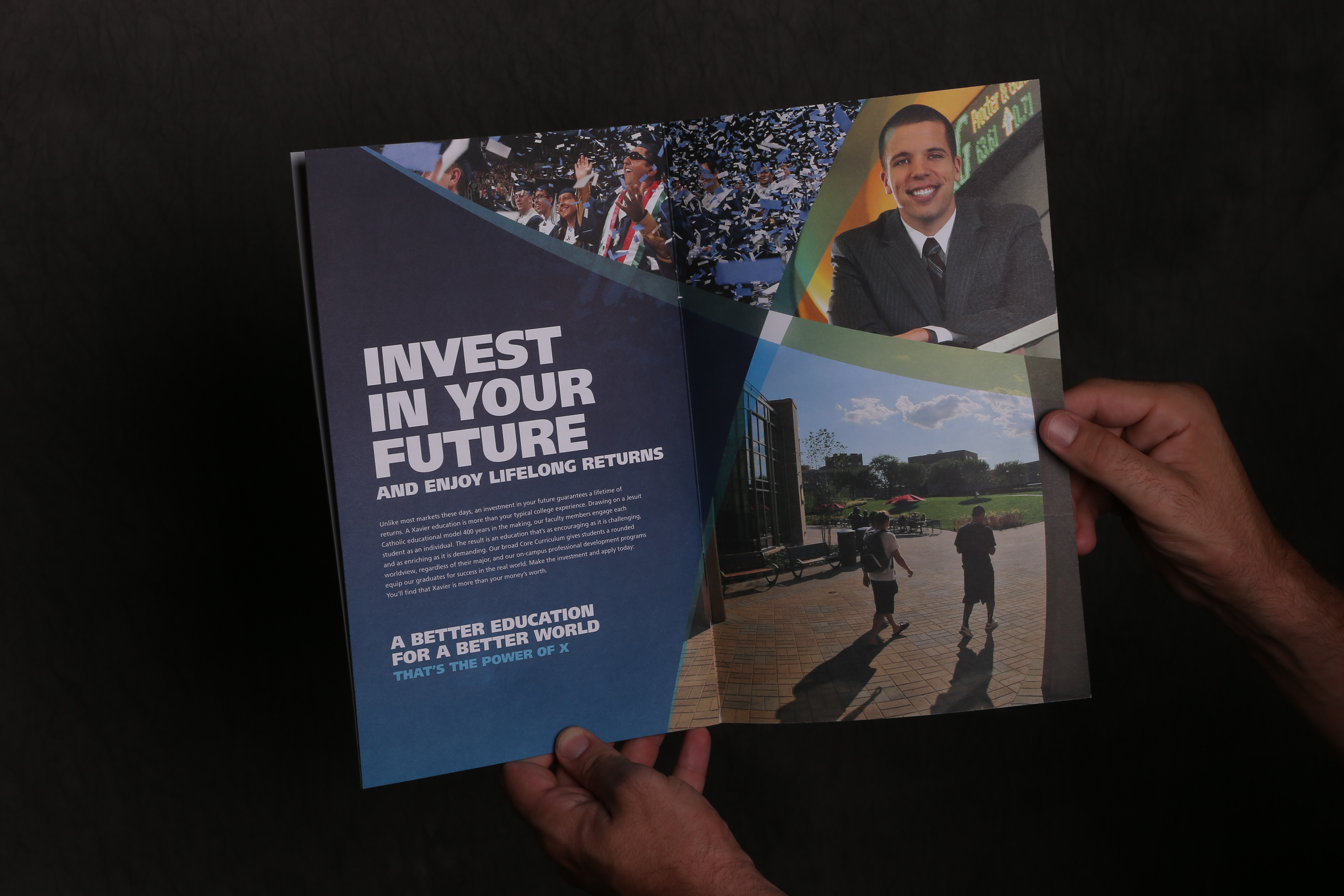
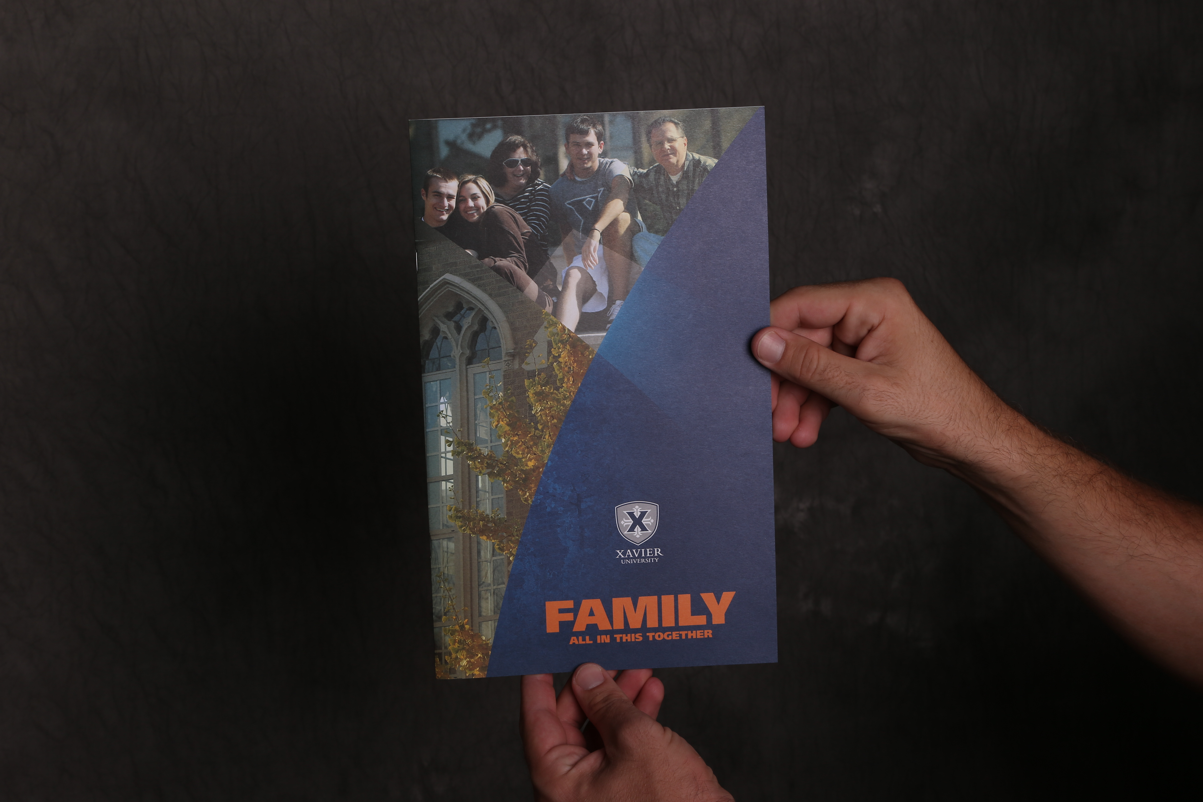
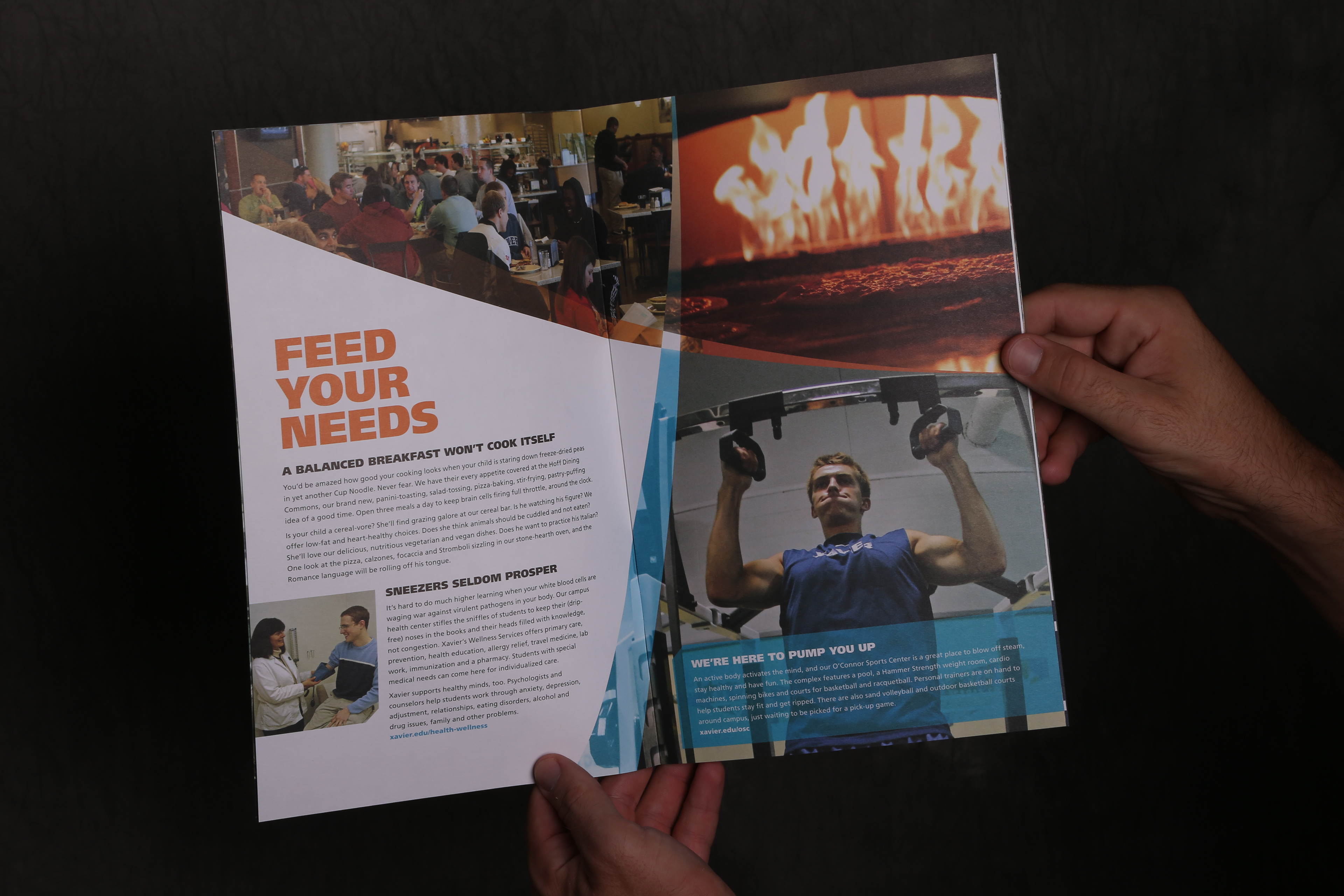
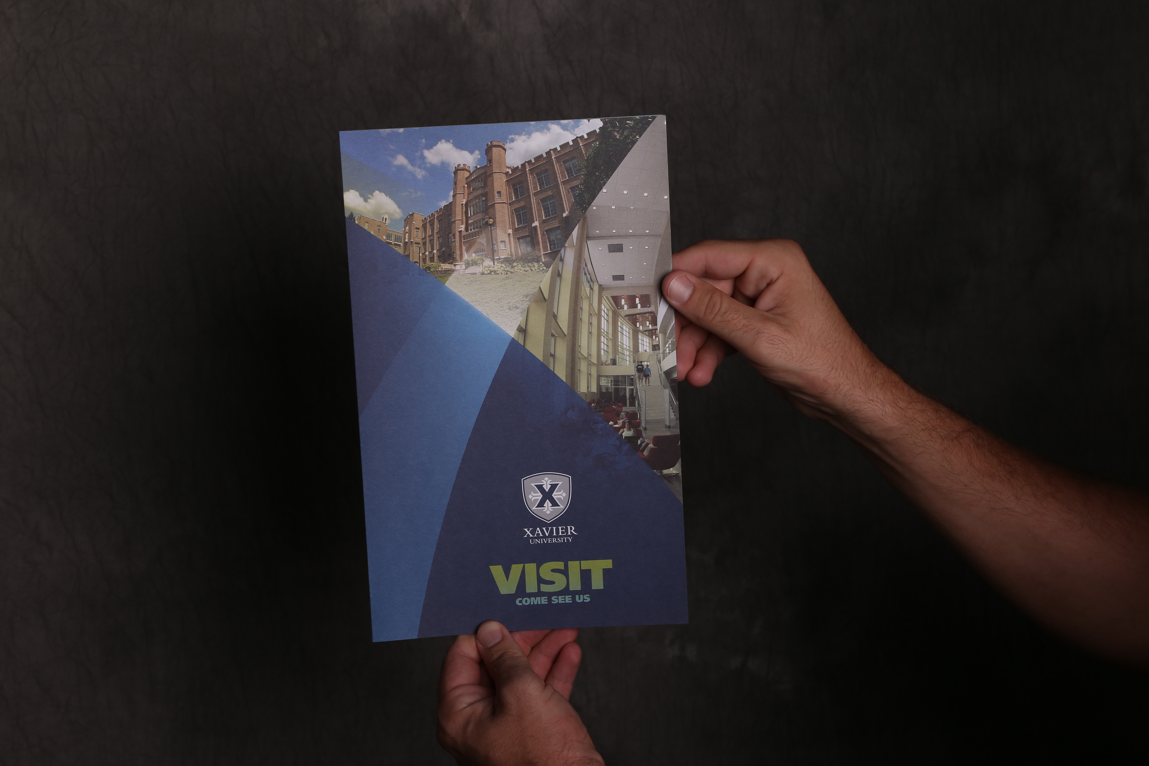
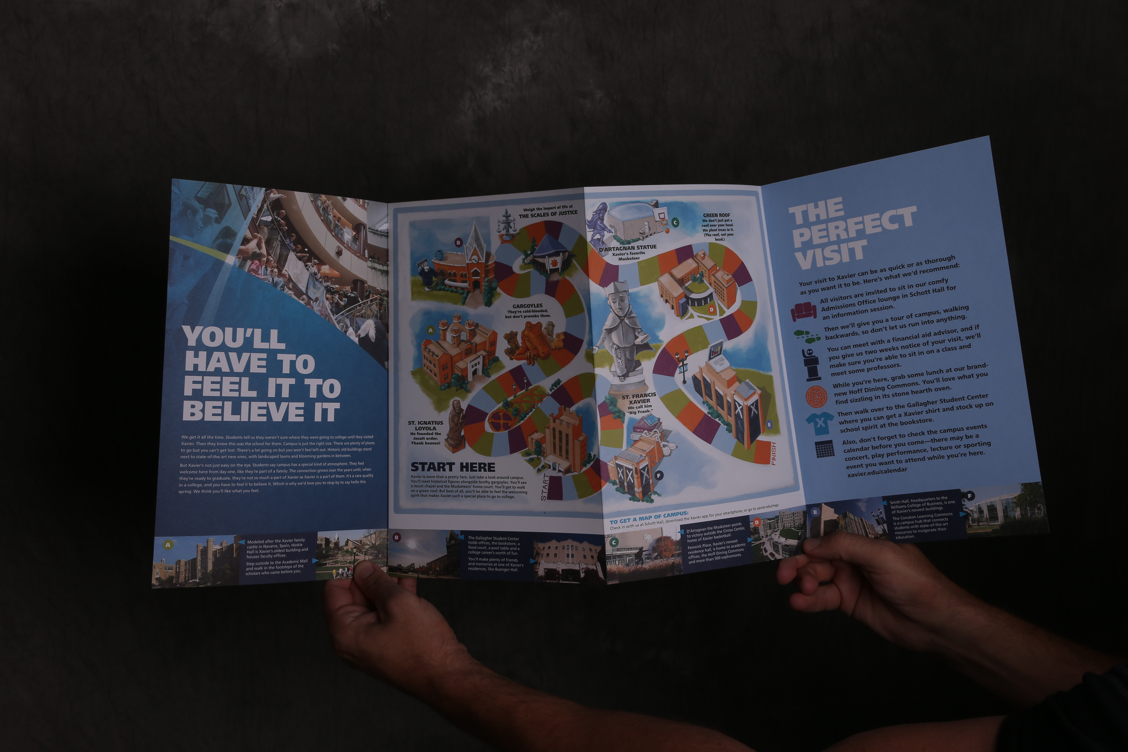
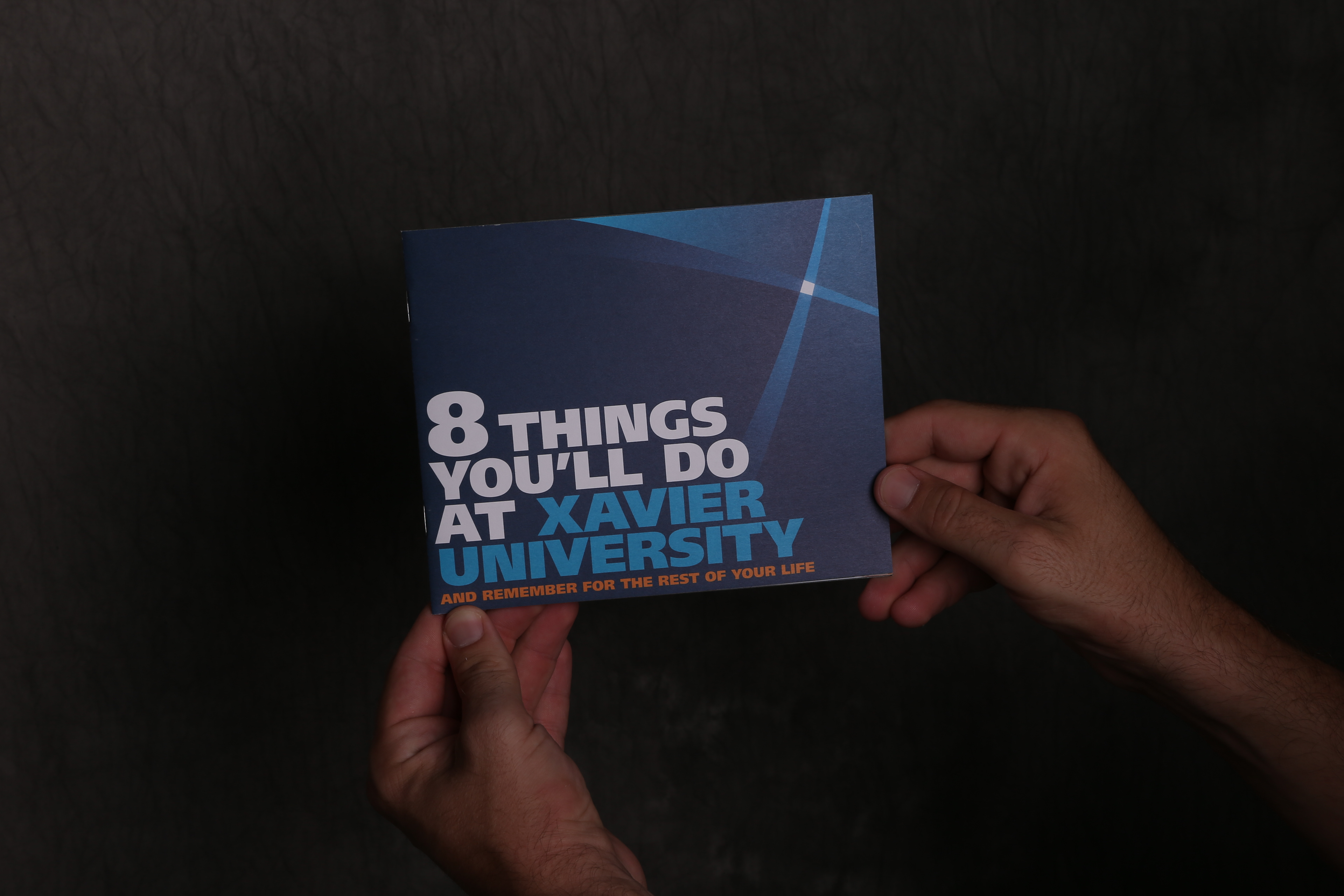
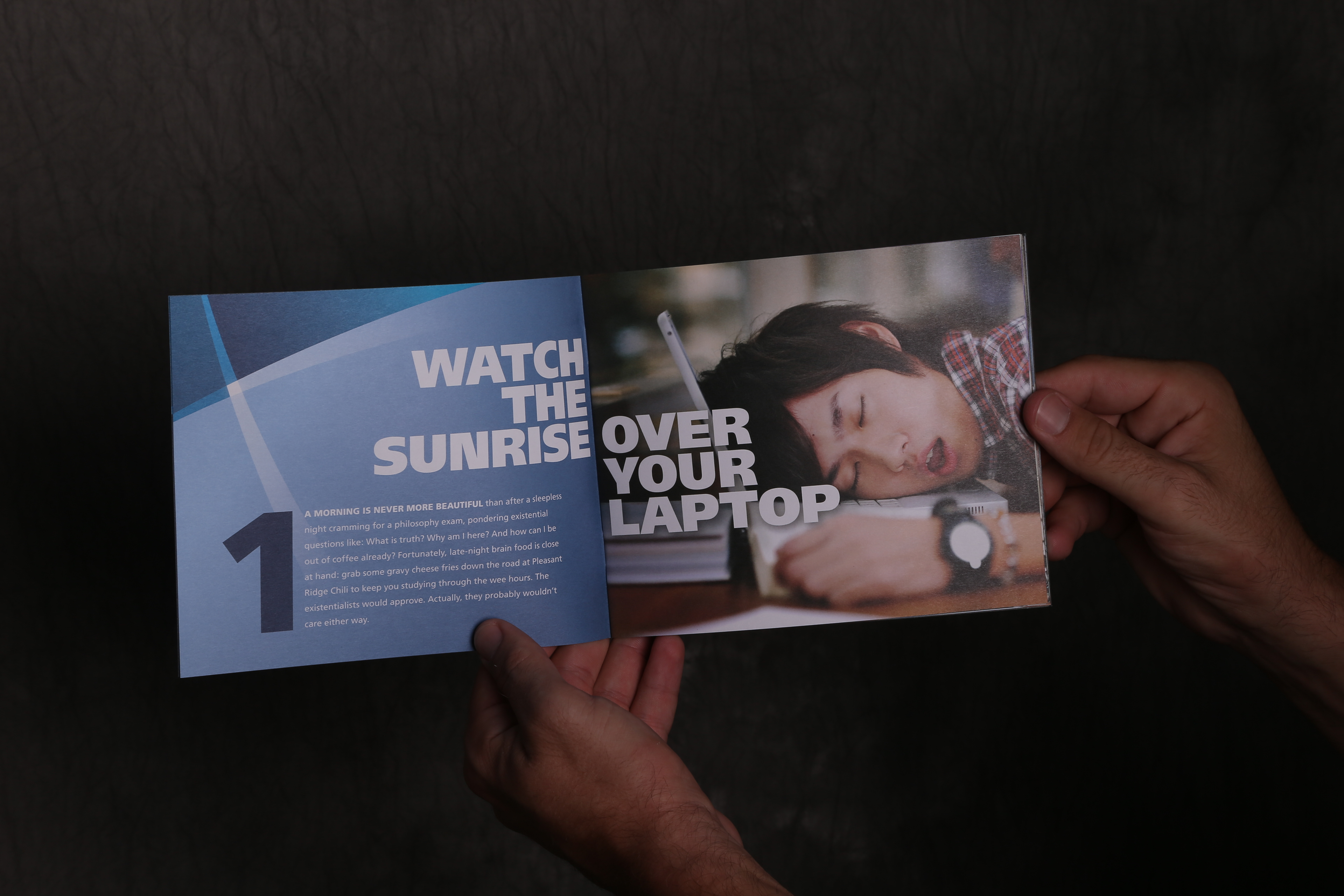
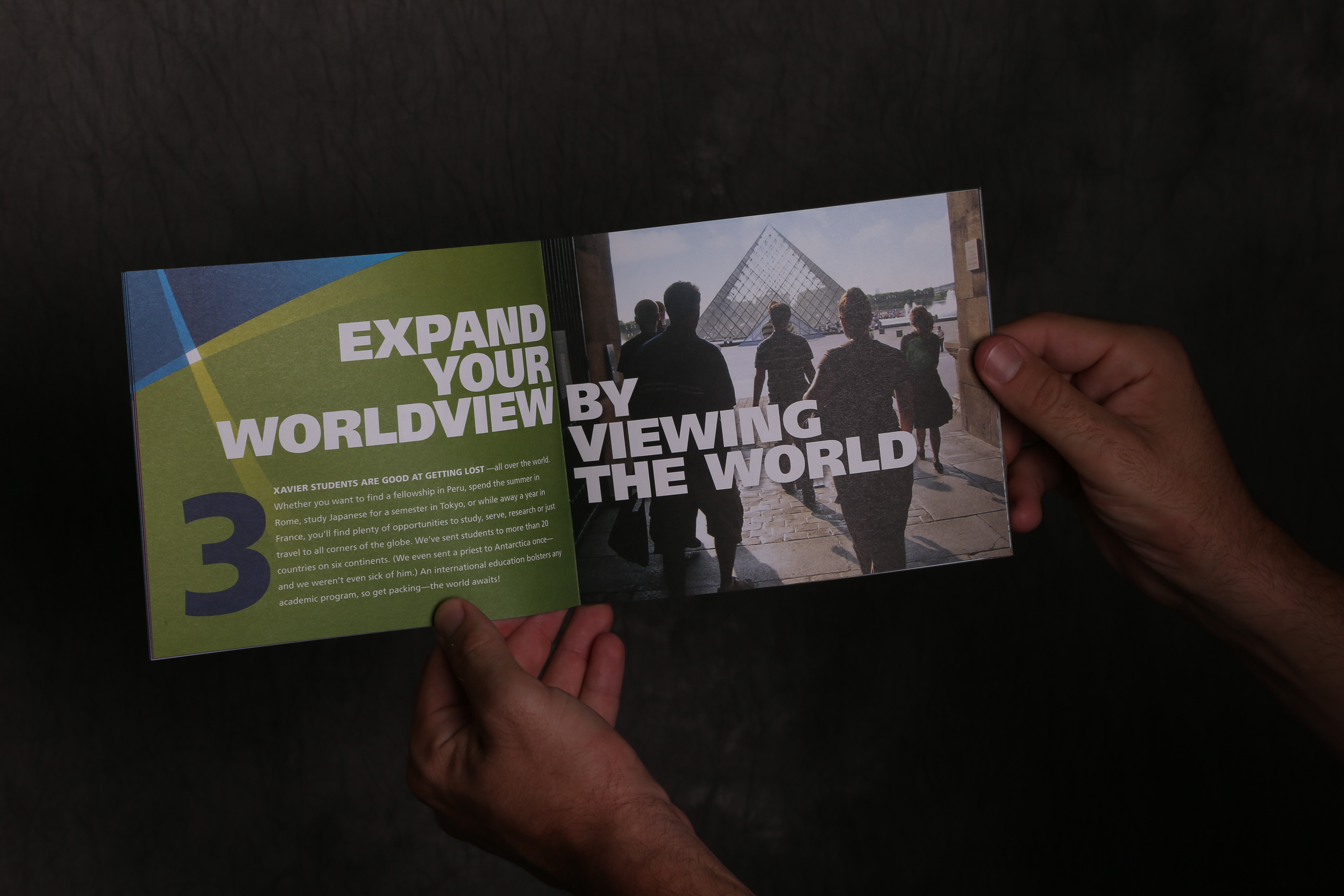
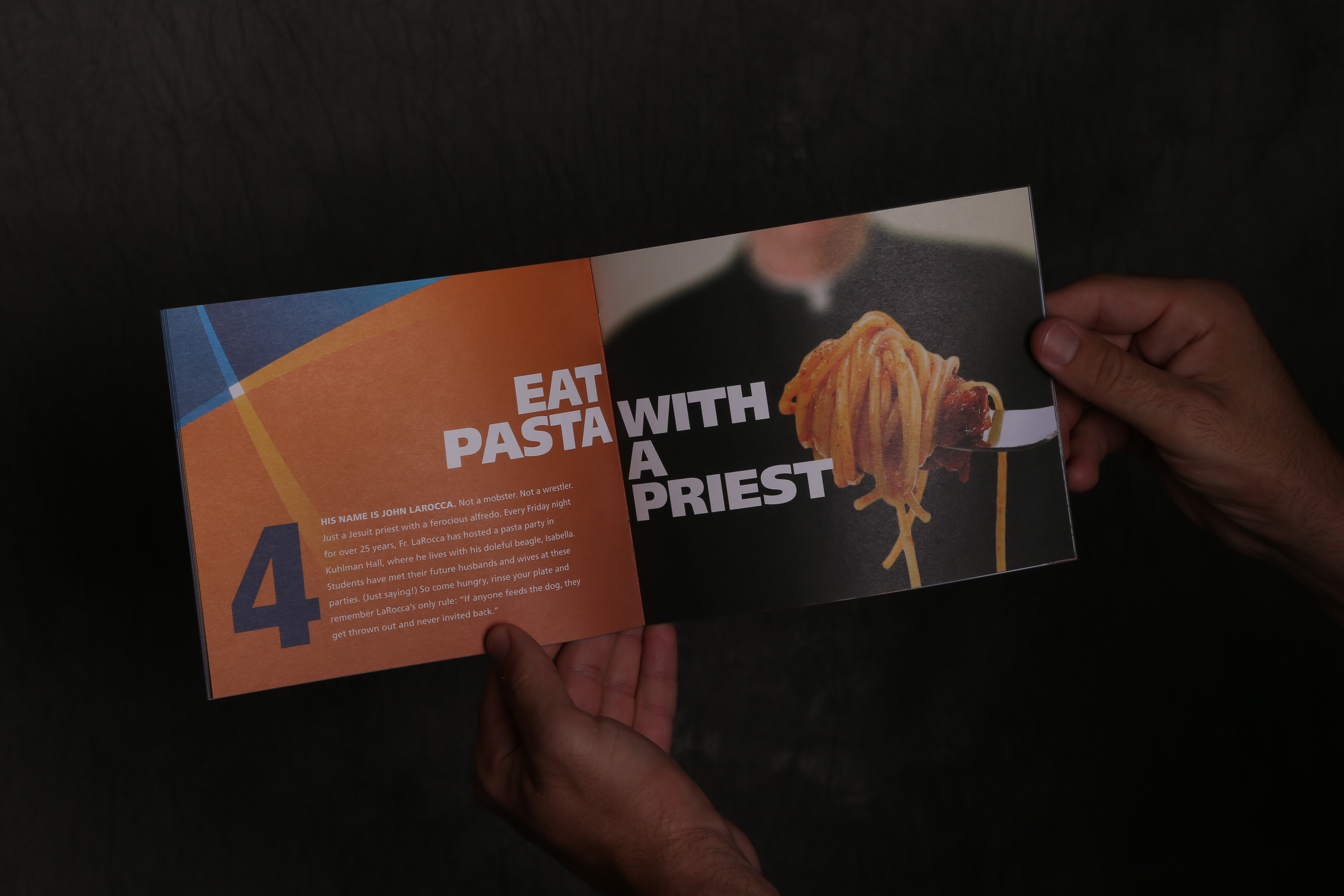
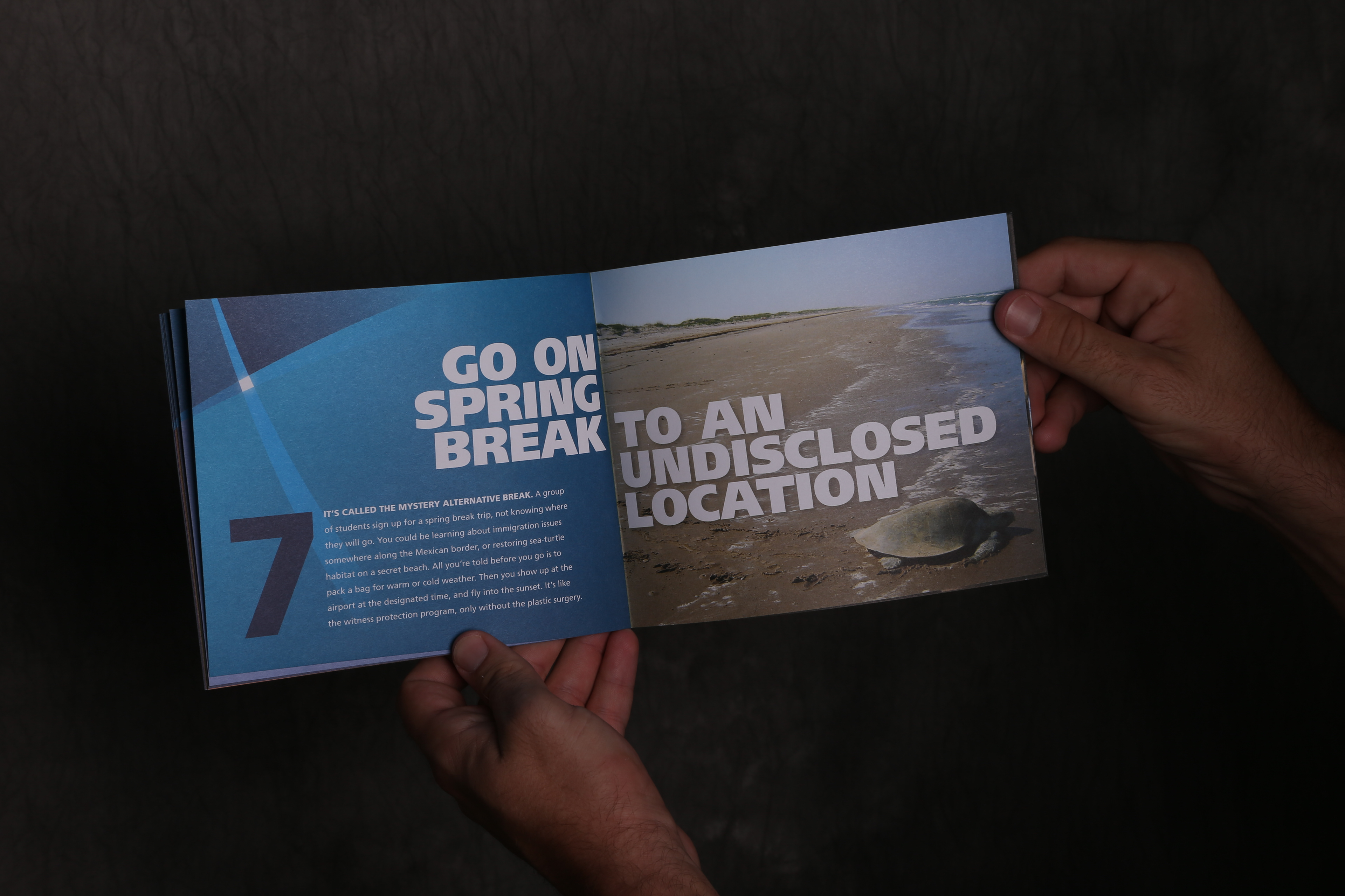
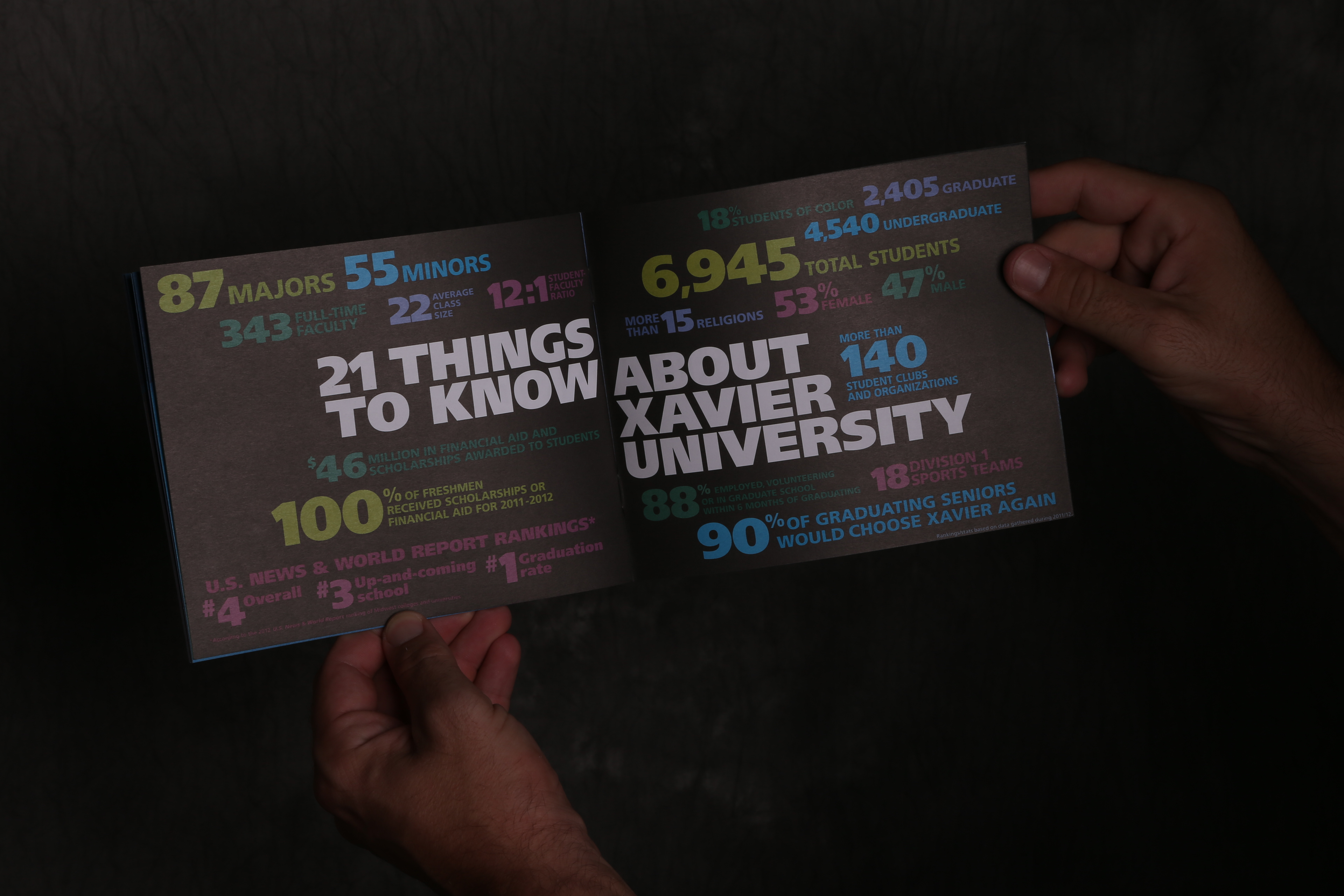
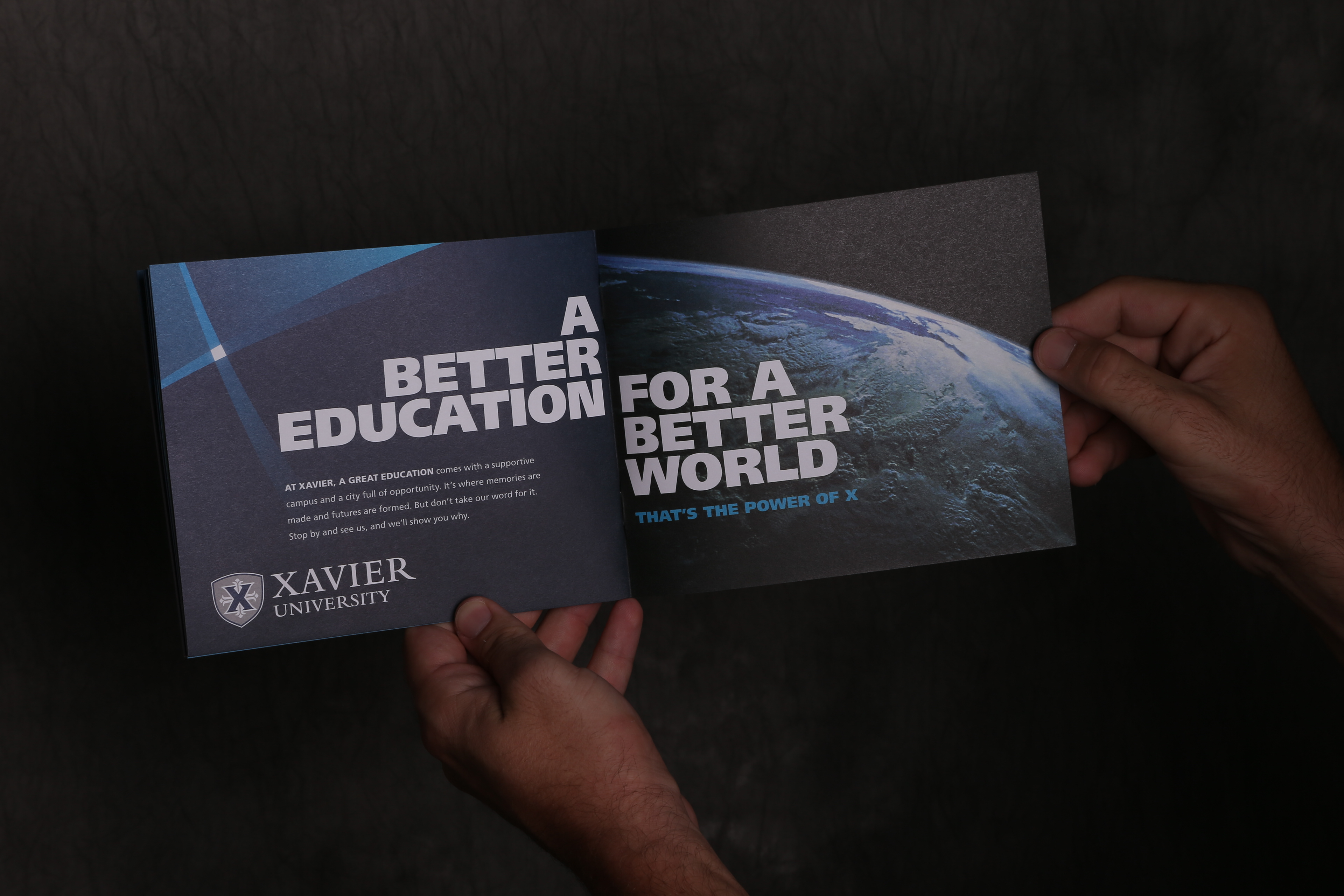
We used a marketing funnel perspective to map what milestones (investigating options, touring campuses, applying for financial aid, etc) and created a series of pieces to give a prospective applicant the information about us at hand for each decision point in the line. It started with a small teaser piece called "8 things you'll do at Xavier University" using creative photography to highlight memorable and unique parts of the XU experience. It came with a pre-printed visitor parking pass so that the family could visit the University on their own terms. This was followed by a larger general piece that gave an overview of everything Xavier had to offer. The next was "Value" which focused on the medium-sized "just right" option and justified the cost of tuition with the depth of the experience. Next was the "Family" brochure which was structured to follow Maslow's Heirarchy of Needs so that we could give the parents the information about how the university covers the student's needs as a place to live, a place to learn, and a place to grow. The series ended with the "Visit" piece that gave details on how to schedule a tour, an illustrated CandyLand-style map for a self-guided tour, and other relevant details.
There was a 24% increase in undergraduate applications after we launched this new series of materials.
